About

I'm Front End developer with a great eye for visuals
Hi my name is Ariel, just like the little mermaid and welcome to my Front-End Engineer/Developer portfolio! I have been a developer for almost 10 years, working mostly with front-end, meaning “I like to make your web apps look pretty”. Throughout my journey I’ve worked with a lot of technologies, frameworks and CMS’s. From the first version of Angular(sheesh!), to Vue.js and now working heavily with React and collaborating with Back-End developers. I love subtle animations and engaging users when they come to something I’ve built. I’ve also taken a strong interest in accessibility since I feel all users should be able to enjoy an experience. When I am not making cool things, I like to play basketball and workout, eat tacos and pizza, and trying not to blow my fantasy football season away.
Projects
- All
- Websites
- React Components
-


Multi-Select with Token (A11Y)
As an employee for Velir I built a re-usable multi-select input that populates “tokens” of what the user selected. In this scenario, a teacher can select the grades that they teach on an online platform I helped build and maintain. Accessibility was also very important, so I ensured that this component can be used without a mouse, using the keyboard.
-


Business Group Health | Search
During my time at Velir, I was assigned a project with Business Group on Health to update their search page. They chose to use Coveo’s Atomic library, a tool I hadn’t worked with before. Given my experience in agencies, adapting to new technologies quickly has become second nature. Through research and experimentation, I successfully built a new search page utilizing Coveo’s AI search capabilities, filters, and queries. This project provided valuable experience working with Coveo, despite some interesting challenges along the way.
-


OER | Lesson Pages
During my time at Velir, I worked extensively on the OER project, including a major redesign of the lesson pages. The lesson pages contained a wealth of learning content alongside dynamic components, all of which needed to stay in perfect alignment. These components were interchangeable and reusable, including an image carousel with zoom functionality, a video viewer, and “material items” that linked to articles and other content. One standout feature was the left navigation, which allowed users to scroll directly to specific sections for easy navigation. Collaborating with back-end developers ensured seamless functionality across the site, resulting in a smooth, top-notch user experience.
-
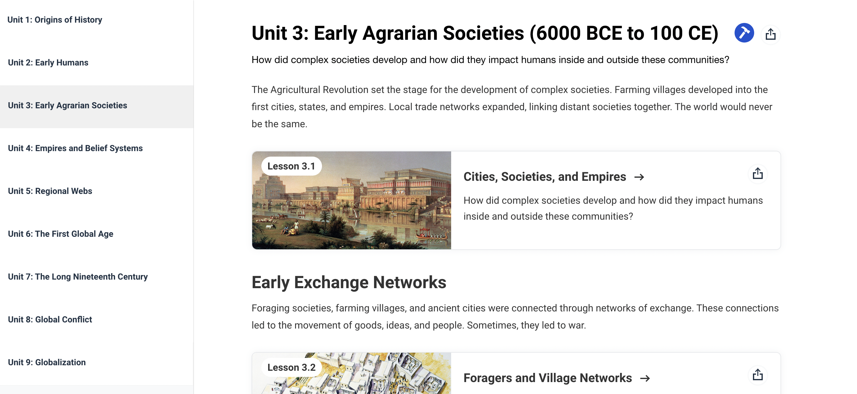

OER | Unit Pages
During my time at Velir, I worked extensively on the OER project, including a major redesign of the unit pages. Thanks to the reusability of components from other pages I built, the process was efficient and seamless—there’s nothing quite like the beauty of reusable components! Additionally, I reworked the left navigation to meet the client’s specific requirements, ensuring it aligned with their vision while maintaining a smooth user experience.
-
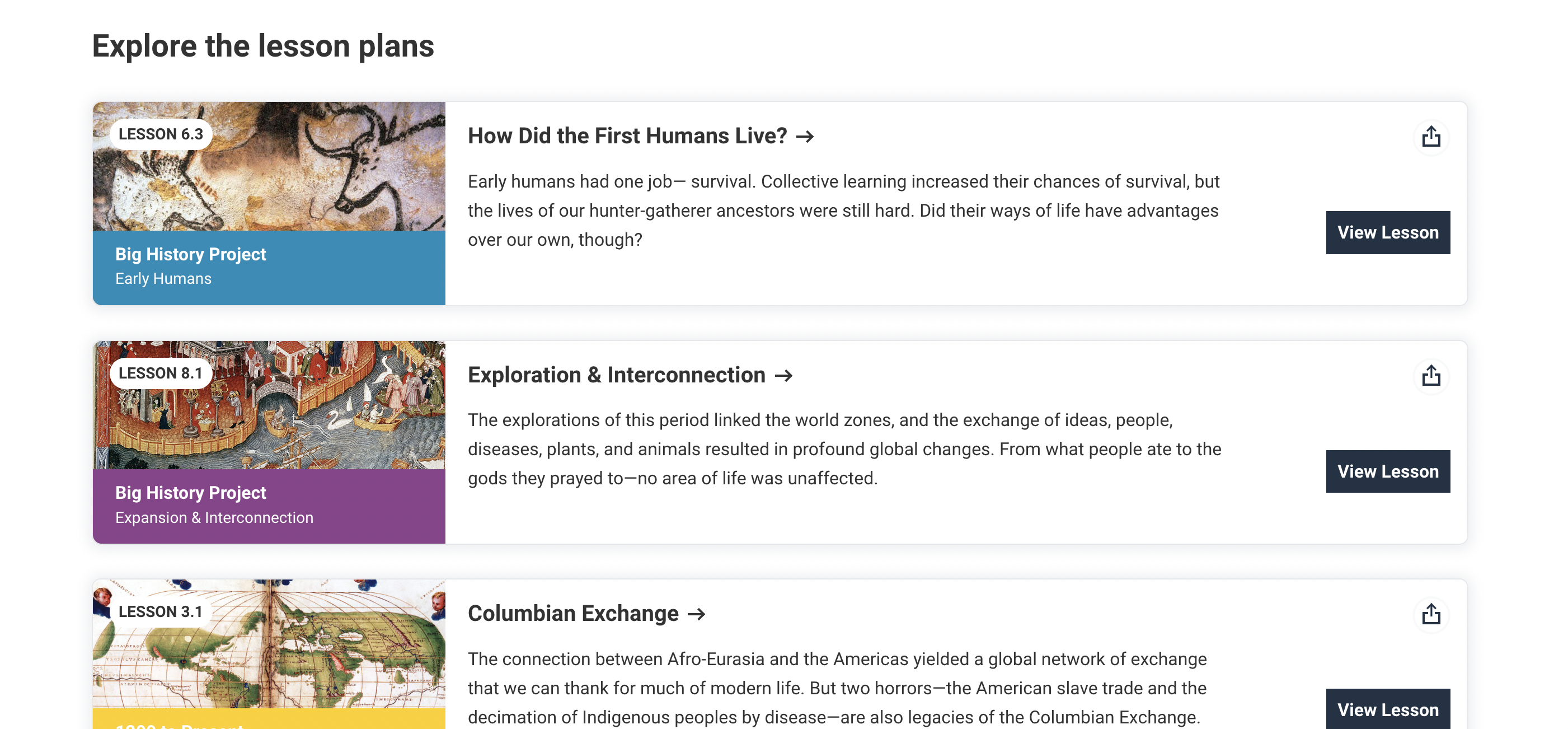

OER | Topic Pages | Topic Lesson List
During my time at Velir, I worked extensively on the OER project, including a major redesign of the topic pages. One of the key components I developed was the “Topic Lesson List” section, designed to be reusable across the site. This component featured cool hover states for the image, text, and background color, adding a dynamic touch. A challenge arose when trying to maintain the same breakpoints used throughout the site—while I initially aimed for consistency, I had to implement a different breakpoint for this component to prevent awkward image and text behavior around the tablet size. Ensuring the component looked great on all devices ultimately took priority over strict breakpoint uniformity.
-
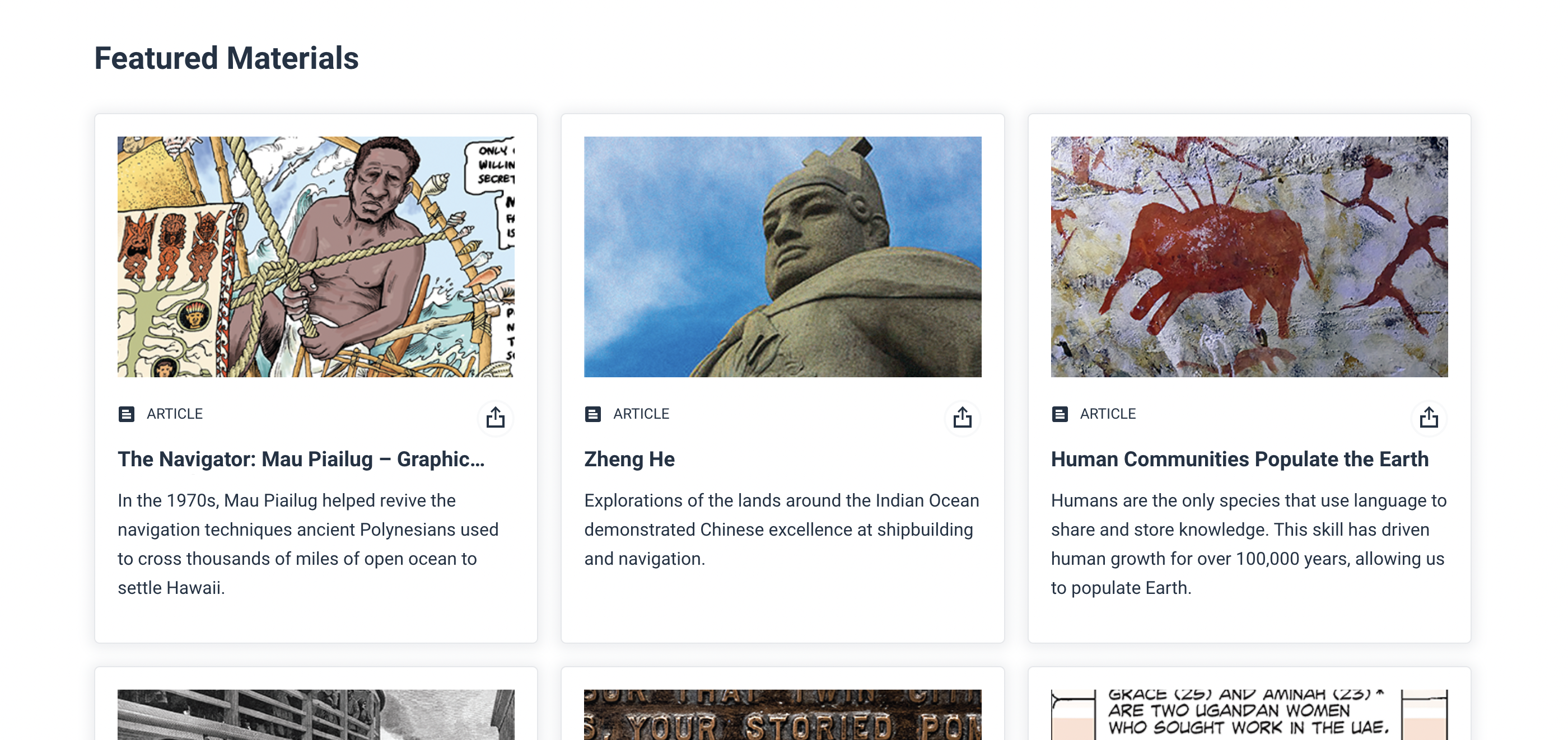

OER | Topic Page | Featured Materials
During my time at Velir, I worked extensively on the OER project, including a major redesign of the topic pages. One of the key components I developed was the “Featured Material” section, which had a blog grid-like design. A critical aspect of this component was its reusability across the site, something highly valued by the client. Implementing the image zoom effect on hover was an interesting challenge, especially as we worked with the client to define the types of images used. Collaborating closely with the client to meet their needs while ensuring a great user experience was a rewarding and insightful learning process.
-
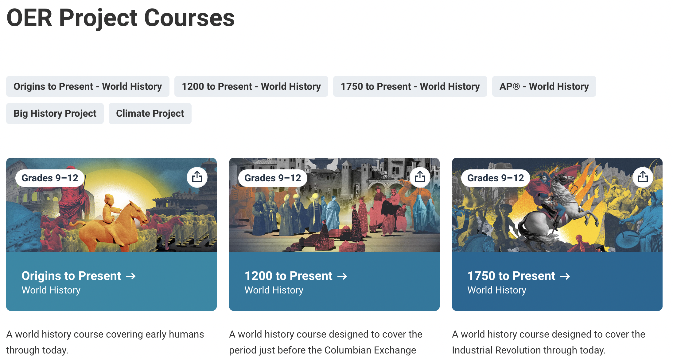
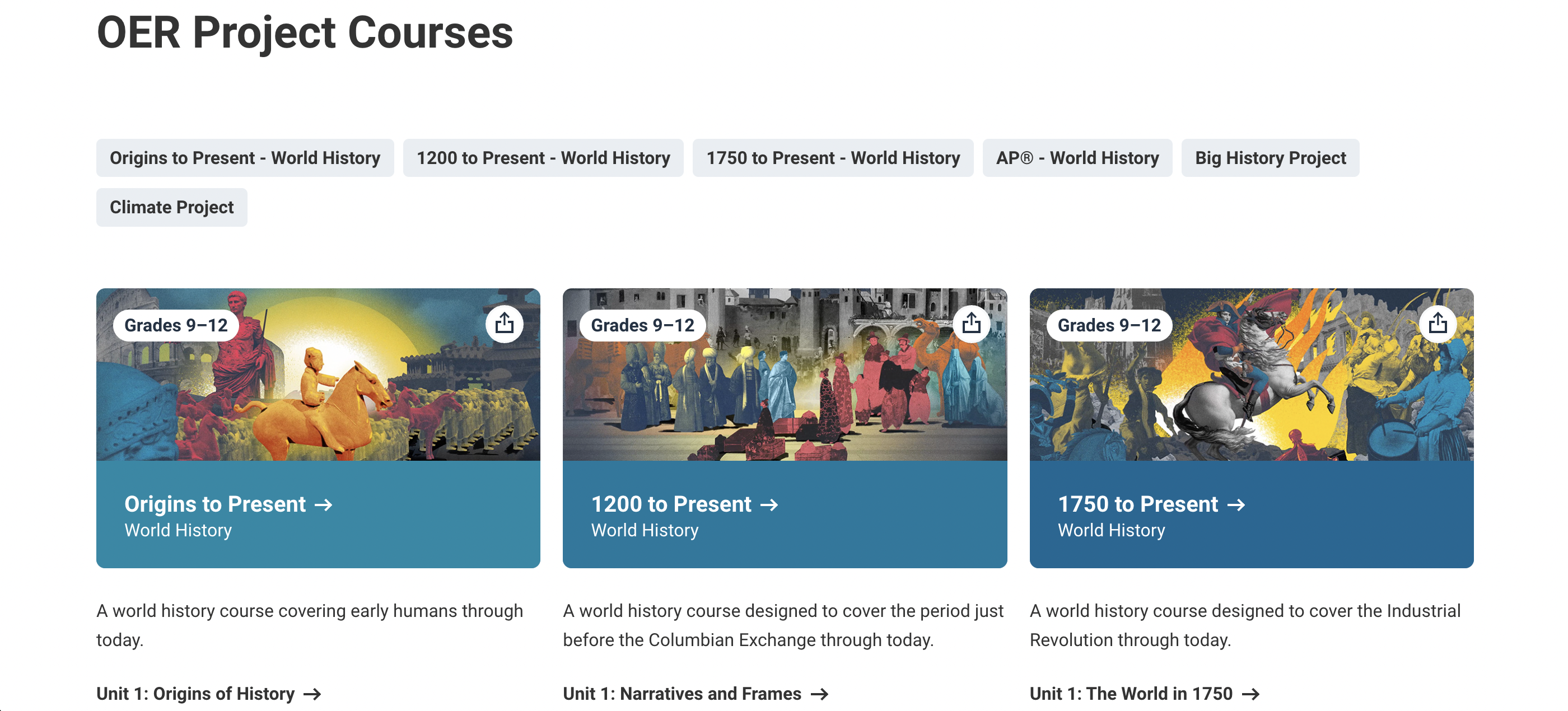
OER | Course Page
During my time at Velir, I worked extensively on the OER project, including a major redesign of the courses page. The new design called for a grid layout, and while I was more experienced with Flexbox, I took this as an opportunity to expand my skills with CSS Grid. This project helped me understand when to use Grid versus Flexbox, and I also explored new CSS techniques, such as text-underline-offset and text-decoration-thickness, to enhance the visual design. I’m particularly proud of the subtle hover animations I implemented for the links—check them out for a seamless user experience!
-
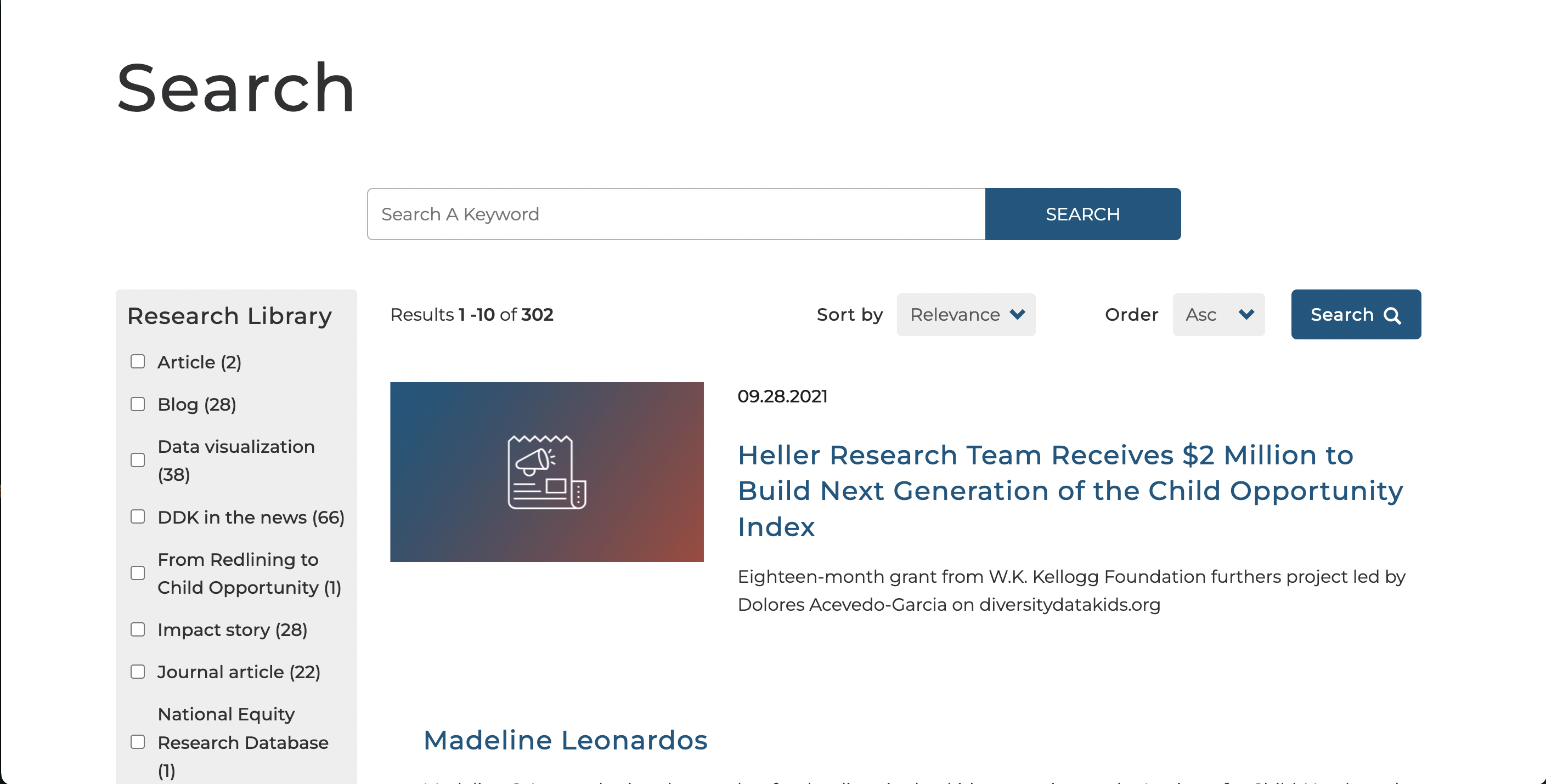

Diversity Data Kids | Search
In addition to the homepage redesign, I worked on improving the search page to enhance user experience and streamline functionality. We followed industry best practices to reorganize the placement of filters and sorting options, ensuring that users could easily navigate and refine their searches. Special attention was given to the mobile experience, making filters more accessible, intuitive, and user-friendly. While the design follows familiar patterns seen on many search pages, this familiarity aligns with user expectations, providing a seamless and efficient experience.
-
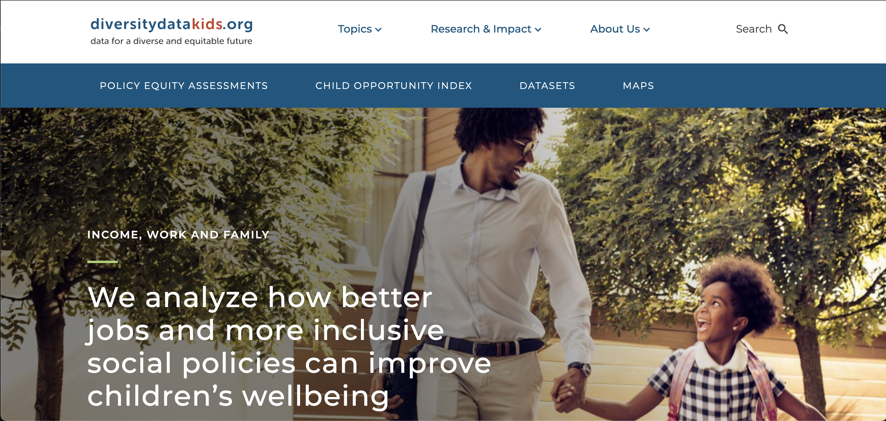

Diversity Data Kids | Homepage Update
During my time at Velir, I was tasked with revamping the homepage to align with new design standards. This included reworking key elements such as the menu, footer, and various homepage components. I took a proactive approach to accessibility, focusing on improving navigation for keyboard users. For example, I ensured proper interaction with the menu and footer, and suggested implementing a pause button for the carousel to meet WCAG 2.2.2 guidelines (Pause, Stop, Hide). Additionally, I refined my estimation skills, following Velir’s project management practices to deliver work efficiently and on schedule.
-
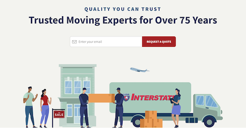

MoveInterstate
The most challenging part of this project was the multi-step form. Mainly, ensuring that what was completed is what the client wanted. Sometimes the client has trouble communicating exactly what they need. It was a great learning experience on communicating with clients. Not to mention the design of this website was great and fun to build!
-
Veritas Farms
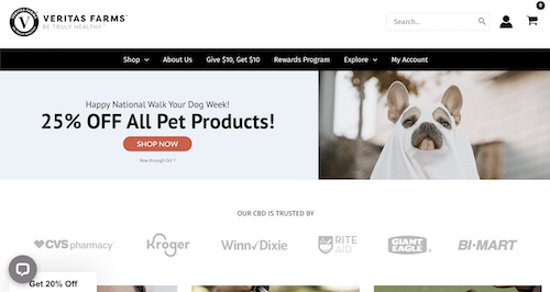
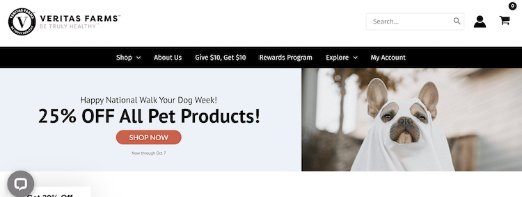
Working with Gutenberg on this project was a blast. I made a lot of custom sections that are re-usable throughout the site. I also helped run their campaigns through Klaviyo.
-
VidaBars
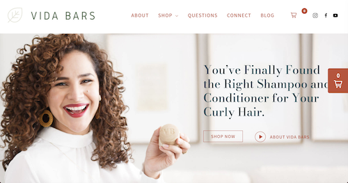
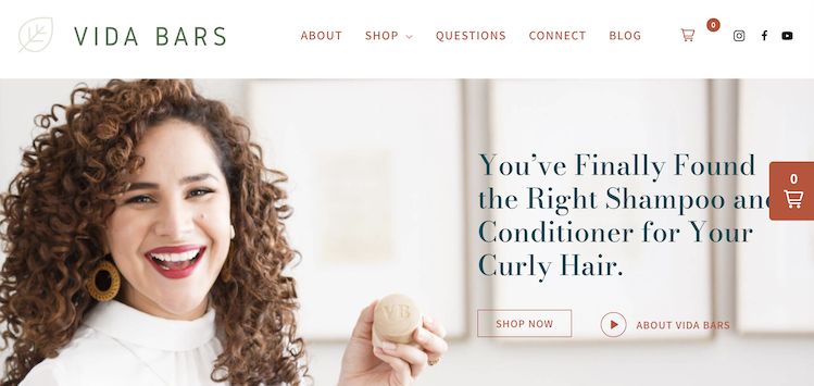
This project was a new experience for me, as it involved building an e-commerce site using Shopify on the backend to simplify store management for the client. For the frontend, we used WPShopify to seamlessly connect their Shopify store with their WordPress site, then built out the front-end using a page builder. The integration allowed for a smooth, user-friendly experience while giving the client full control over their store
-
SamRust Seafood
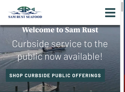
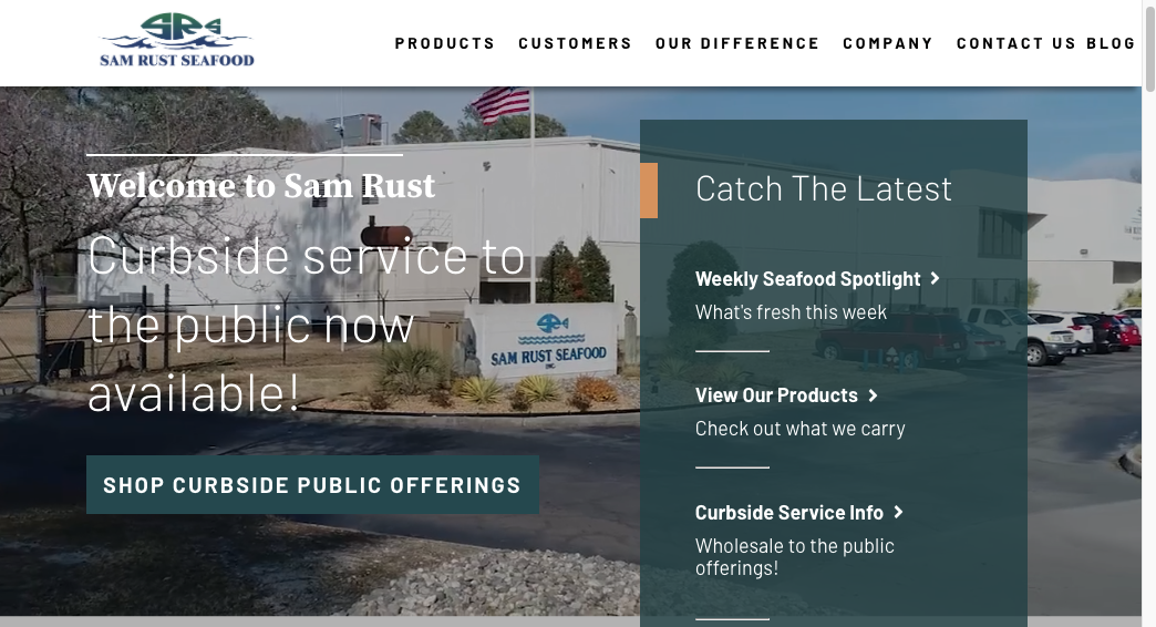
I had the pleasure of working with an incredibly talented designer on this project, whose beautiful design really set the stage for success. The design posed a unique challenge due to several overlapping elements, but it pushed me to think critically about how to implement each section in a way that would not only honor the design but also make it fully customizable for the client post-handoff. Balancing aesthetics with functionality was key, and in the end, the project turned out great—it even won an award!
-


Granite Outlet
I love this site for its very simple color scheme that somehow relates to their industry. This site was made with WordPress, using SCSS. Although a lot has changed about it since it was handed to the client, its beautiful to me. My favorite thing about this site is the homepage on mobile. We needed a way to have imagery with text over it but I added my own animations. While the user scrolls down over the section with imagery from a particular category, additional text slides in. I love tinkering with JavaScript and CSS to create cool animations.
-
Women’s Bean Project
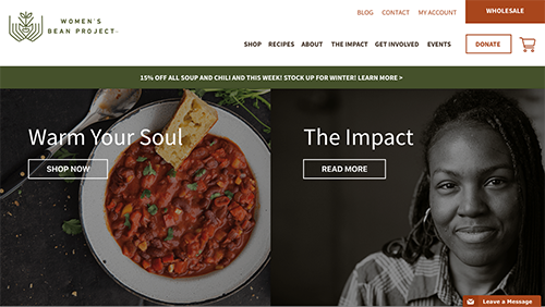
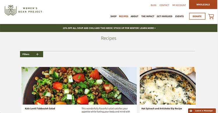
This website is one of the most customizable sites I have been a part of. It came with a lot of collaboration with another amazing developer and designer. The other developer had an extensive task of creating the eCommerce side of this site using WooCommerce. The designer made beautiful mockups that I had the honor of creating. All content on the site, from copy to images can be updated by the client/author with minimal amount of WordPress plugins. This was a great learning experience from start to finish and I was glad to be a part of it!
My skills
I am an exxperienced Front-End Developer with a proven track record of delivering high-quality, scalable, and performance-optimized web applications. With expertise in frameworks like React.js and Vue.js I excel at creating reusable components, ensuring W3C and A11Y compliance, and enhancing user experience.
I’ve managed multiple client projects independently, often as the sole Front-End Developer, collaborating with cross-functional teams to integrate front-end components with APIs. My background spans working with WordPress, WooCommerce, Shopify, and SiteCore, driving innovation and customer satisfaction.
Known for quickly adapting to new codebases and leading project execution, I bring a strong mix of technical skills and a user-centric approach. I’m passionate about modernizing applications and processes, whether it's through transitioning React projects to function-based components or optimizing SCSS for maintainability. Remote work has further sharpened my communication and self-management skills, helping me thrive in distributed environments.
CSS3
SASS
Tailwind
Vanilla JS
Vue.js
React.js
Node
W3C Standards/A11y
WordPress
Management Skills
Professional Experience
2022 - Current
Velir | Mid-Level Front End Developer
I independently managed multiple client projects as the sole Front-End Developer, collaborating with Back-End, Sitecore, AEM, and Drupal teams to integrate front-end components with APIs according to client requirements. I optimized applications for performance and scalability, modernized projects by transitioning from class-based to function-based React.js, and worked closely with clients and designers to develop new React components from the ground up. In addition, I evaluated designs to ensure W3C standards compliance, created reusable components to improve code efficiency, and conducted SCSS file audits to remove unnecessary code for better performance. I also reviewed components to ensure they met W3C and A11Y standards.
2020 - 2022
Mindsize | Front End Developer
I led front-end development projects by collaborating with project managers to set timelines and assign tasks to the most suitable developers. I developed and deployed updates for WooCommerce and Shopify, improving both functionality and user experience. I’m adept at executing rapid changes with minimal disruption, ensuring timely delivery. Additionally, I authored comprehensive documentation to support future developers and streamline project onboarding. By introducing GitHub workflows and task management processes, I enhanced team collaboration and code quality. I also contributed to building a dynamic platform with Vue.js, Laravel, and Inertia.js, driving innovation and performance improvements.
2017 - 2020
Silverback Strategies | Senior Web Developer
As a front-end developer, I represented the development department, addressing client questions and concerns. I worked closely with graphic designers, content managers, and SEO specialists to build custom WordPress websites from start to finish. Using PSD or Sketch designs as a foundation, I developed sites while adding my own creative elements. I also worked across multiple CMS platforms to ensure sites were easily editable for non-technical users. In addition to building sites, I handled ongoing maintenance by optimizing page speed, performing updates, and testing on a bi-weekly basis. I improved the process of delivering seamless WordPress experiences for clients and conducted in-depth User Experience Audits. Additionally, I created interactive landing pages using the WordPress API and React.js, driving user engagement and functionality. I also have to mention, I built an award winning site!
May 17' - Dec 17'
Barkly Pets | Front End Web Developer
As a Front End Developer at Barkly Pets, I worked extensively with new technologies, gaining a deep understanding of PHP. Being part of a startup, I played a key role in helping the business grow by revamping the company’s web properties. This involved migrating the entire site to WordPress and updating pages for a modern look with added UI elements. I also incorporated SEO tactics, resulting in a 150% growth in organic traffic over five months. In addition to the technical work, I created design mockups using Adobe Illustrator and enhanced the site with animations, such as scroll effects and popups, which boosted user engagement and conversion rates. I also trained colleagues on how to effectively use WordPress and continuously optimized the site for both performance and SEO.
2015 - 2017
TrueChoice Solutions | Interactive Developer
At TrueChoice Solutions, I worked extensively with UI elements and developed applications using an in-house process. My responsibilities included building and updating client applications on time, creating dynamic templates for reuse, and enhancing functionality using technologies such as HTML5, CSS3, JavaScript, LESS, Gulp, and Angular. I also set up standard processes for client releases and created a reusable HTML email template for clients. Additionally, I maintained and supported web markup, resolved front-end bugs, and revamped templates with CSS3 animations to improve the user experience. My role involved direct client communication to define project parameters and leading team planning efforts to ensure efficient project execution.
March 2015 - June 2015
Front-end developer Intern
Developing web apps and gaining knowledge of different languages. Worked with the following languages: HTML, CSS, JavaScript, J Query, Angular.js
January 2015 - May 2015
Frontend Development Course
In this course I really started to dive deep into web development instead of teaching myself. I gained a lot of knowledge on HTML CSS and the basics of JavaScript in order to build the foundations needed to create some great UI. I built a portfolio and was at the top of my class.
2009 - 2014
Daniel Webster College
Bachelor's Degree in Psychology, President of the Psychology Club, Captain of the Women's Basketball Team.